Platform enhancement features
Platform enhancement features
Teams:
Teams:
CXD Noida & CRI Bangalore
CXD Noida & CRI Bangalore
Features:
Features:
Home Page tiles, Splash screen, Notification management
Home Page tiles, Splash screen, Notification management
Project 1
Project 1
Home Page Tiles & Navigation
Home Page Tiles & Navigation
As part of platform enhancements, I redesigned the home page tiles and navigation to improve clarity and scalability. The process began with benchmarking super apps and contemporary interfaces, followed by an internal consumer study with 30 participants to evaluate icon styles across simplicity, recognition speed, effort, and visual appeal. We tested four styles (line, filled, faux 3D, and 3D) and selected filled vector icons with accent colors for optimal balance. I then iterated on tile size, layout, and hierarchy to create a clear and intuitive first impression, while also designing a scalable system to accommodate future expansion beyond eight tiles.
As part of platform enhancements, I redesigned the home page tiles and navigation to improve clarity and scalability. The process began with benchmarking super apps and contemporary interfaces, followed by an internal consumer study with 30 participants to evaluate icon styles across simplicity, recognition speed, effort, and visual appeal. We tested four styles (line, filled, faux 3D, and 3D) and selected filled vector icons with accent colors for optimal balance. I then iterated on tile size, layout, and hierarchy to create a clear and intuitive first impression, while also designing a scalable system to accommodate future expansion beyond eight tiles.
Benchmarking
Benchmarking
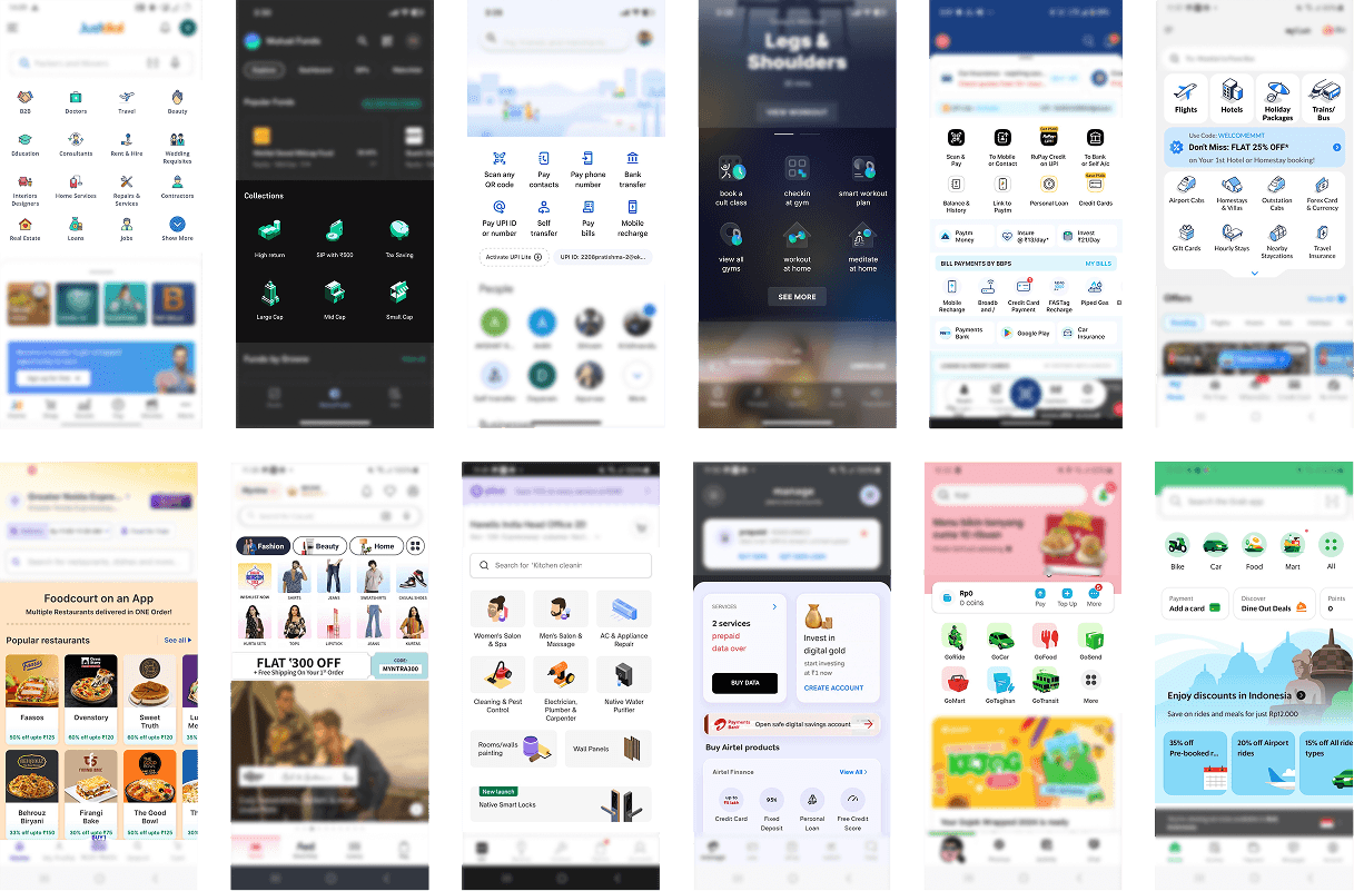
Benchmarking home page tiles in super apps
Benchmarking home page tiles in super apps
Design directions
Design directions
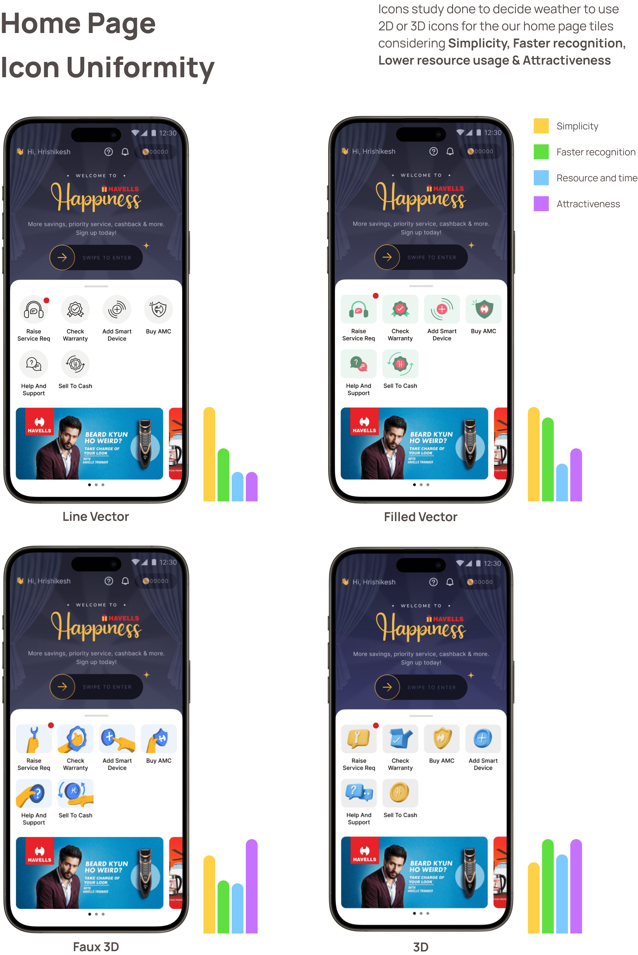
Consumer study with 30 participants to evaluate icon styles
Consumer study with 30 participants to evaluate icon styles
Iterations
Iterations
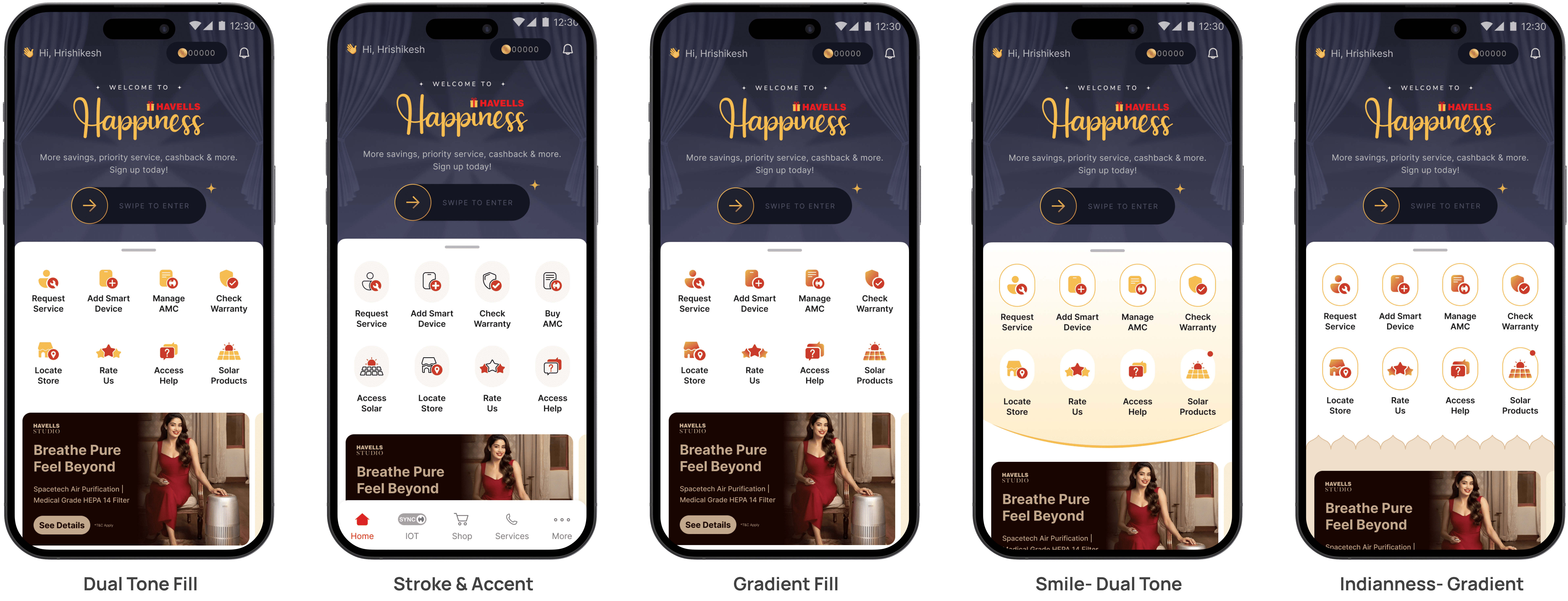
After we decided the icon style, I explored the various ways in which we can represent the homepage tiles, keeping in mind the app personality and visual design language
After we decided the icon style, I explored the various ways in which we can represent the homepage tiles, keeping in mind the app personality and visual design language
Selected design direction
Selected design direction
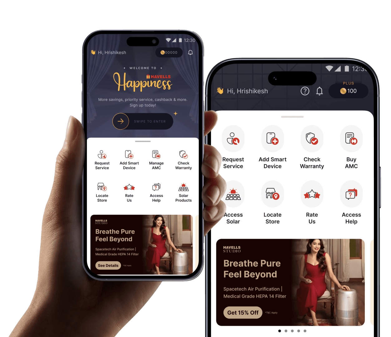
Old Home page tiles
Old Home Page
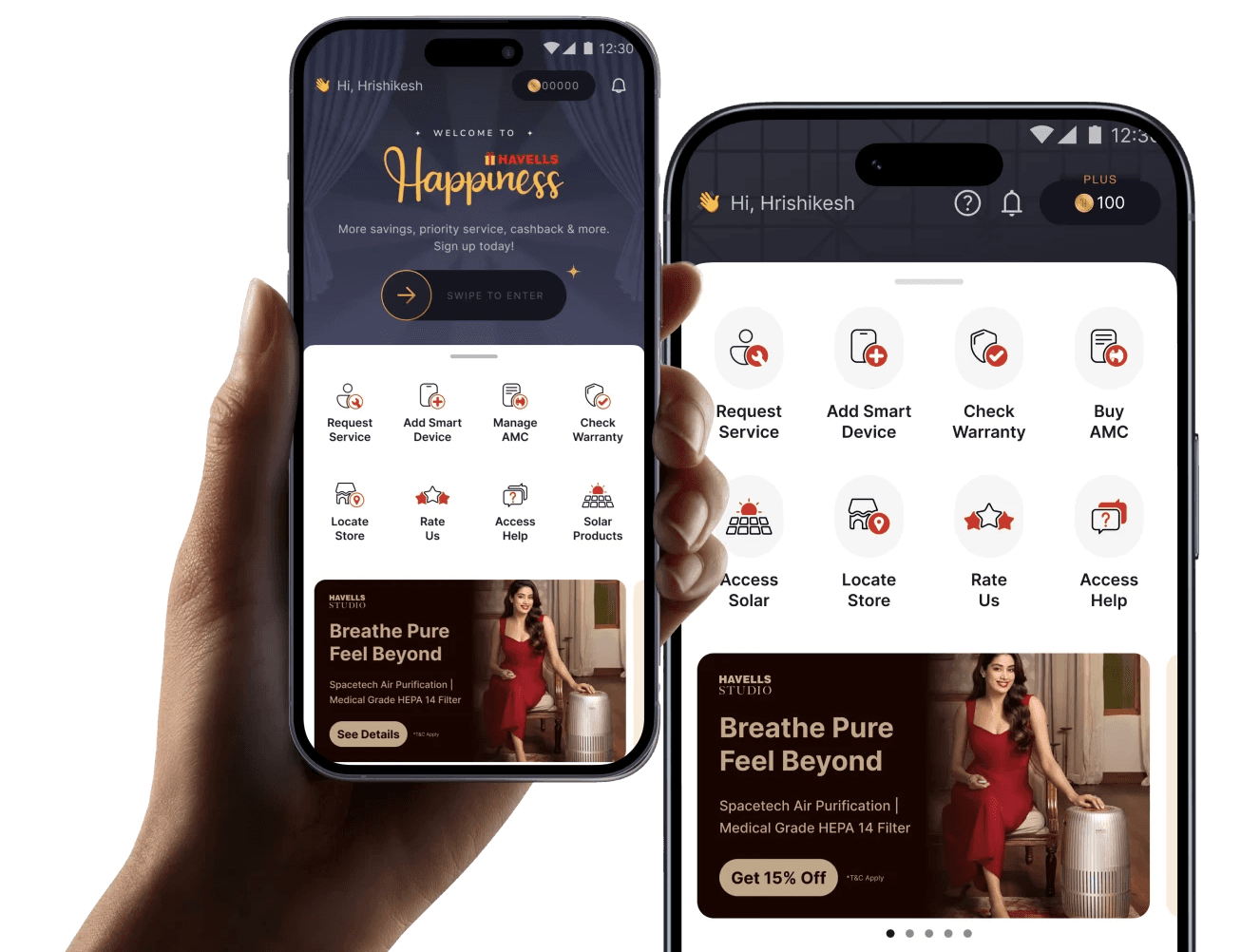
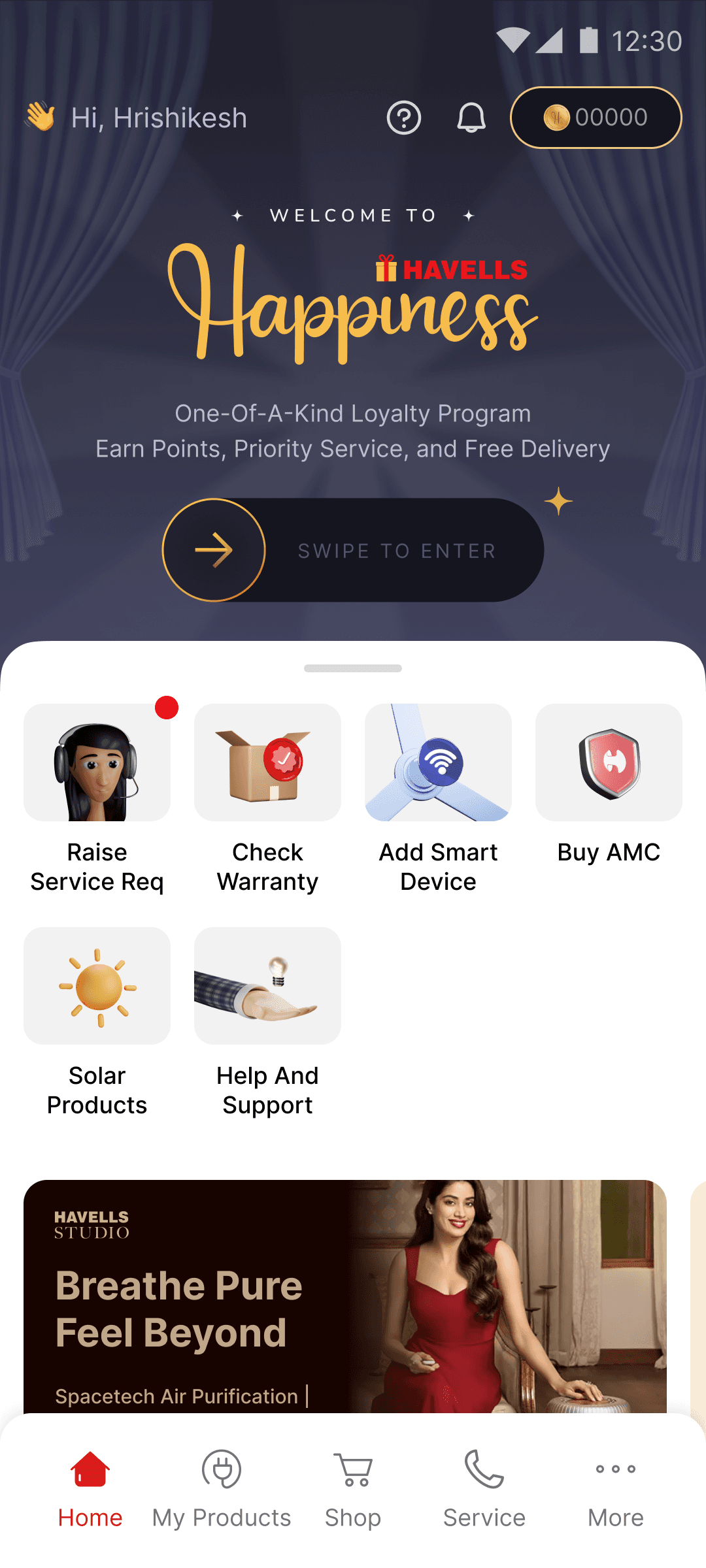
New Home page tiles
New Home Page
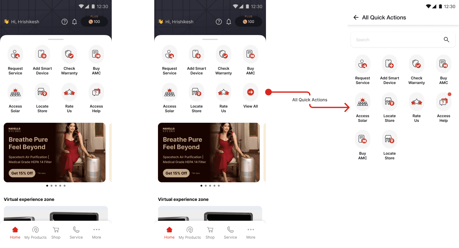
The Home page tiles were designed keeping scalability in mind, we planned for the scenario when we may have more than 8 tiles.
How the home page tiles appear to both registered and unregistered user
Project 2
Project 2
Splash Screen Revamp
Splash Screen Revamp
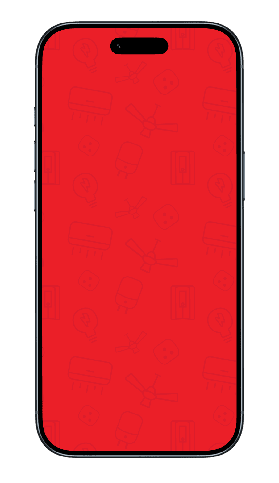
As part of improving app performance, I redesigned the Havells One splash screen with a focus on speed and efficiency. The earlier GIF-based animation was heavy (1.3MB) and slowed down the app experience, so I transitioned to a lightweight JSON-based animation, reducing the asset size by 75% and bringing load time down from ~5 seconds to under 3 seconds.
Conceptually, I designed the animation to feel purposeful yet fast- lines gradually form around the Havells logo silhouette, suggesting energy and connectivity, before swiftly resolving into the final mark and revealing “Havells One.” Subtle device icons in the background hint at the ecosystem without adding visual noise. This approach ensured the splash screen not only loaded faster but also communicated the idea of a connected system coming to life. The exercise also highlighted the need for systematically optimizing large assets across the app, prompting a recommendation to track and reduce heavy files for overall performance improvement.
Project 3
Project 3
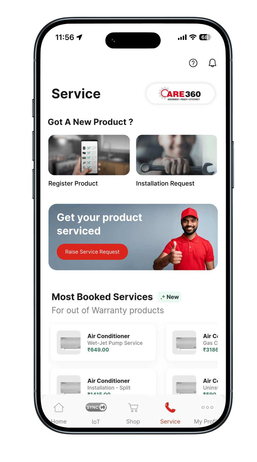
Notification Management System
Notification Management System
As part of scaling the platform, we identified a growing challenge around notification overload. With millions of notifications being sent every minute, there was a clear need to design a structured notification management system that could reduce noise while keeping users informed. The goal was to enable smarter backend filtering, while giving users meaningful control over what they receive.
As part of scaling the platform, we identified a growing challenge around notification overload. With millions of notifications being sent every minute, there was a clear need to design a structured notification management system that could reduce noise while keeping users informed. The goal was to enable smarter backend filtering, while giving users meaningful control over what they receive.

Storyboard for Notification Management
Storyboard for Notification Management
To better understand the user journey and pain points, I created a storyboard that highlighted how notification management was currently missing from the experience. It mapped moments of overload, missed signals, and lack of control, making the problem tangible for both design and product teams.
I began by benchmarking leading smart home and consumer apps to understand how notifications are structured, prioritised, and managed across different ecosystems. This helped uncover common patterns as well as gaps, particularly around lack of clarity, poor categorisation, and limited user control.

Card sorting excercise
Card sorting excercise
Next, I conducted a card sorting exercise with 15 participants within the studio to define intuitive notification categories. This helped us understand how users mentally group different types of notifications and led to a clear, user-friendly classification system.
Next, I conducted a card sorting exercise with 15 participants within the studio to define intuitive notification categories. This helped us understand how users mentally group different types of notifications and led to a clear, user-friendly classification system.
Using these insights, I designed the information architecture and user flows for managing notifications - focusing on simplicity, clarity, and ease of control. We then built and tested a Figma prototype with users to validate our approach, refining the experience based on feedback.
Using these insights, I designed the information architecture and user flows for managing notifications - focusing on simplicity, clarity, and ease of control. We then built and tested a Figma prototype with users to validate our approach, refining the experience based on feedback.
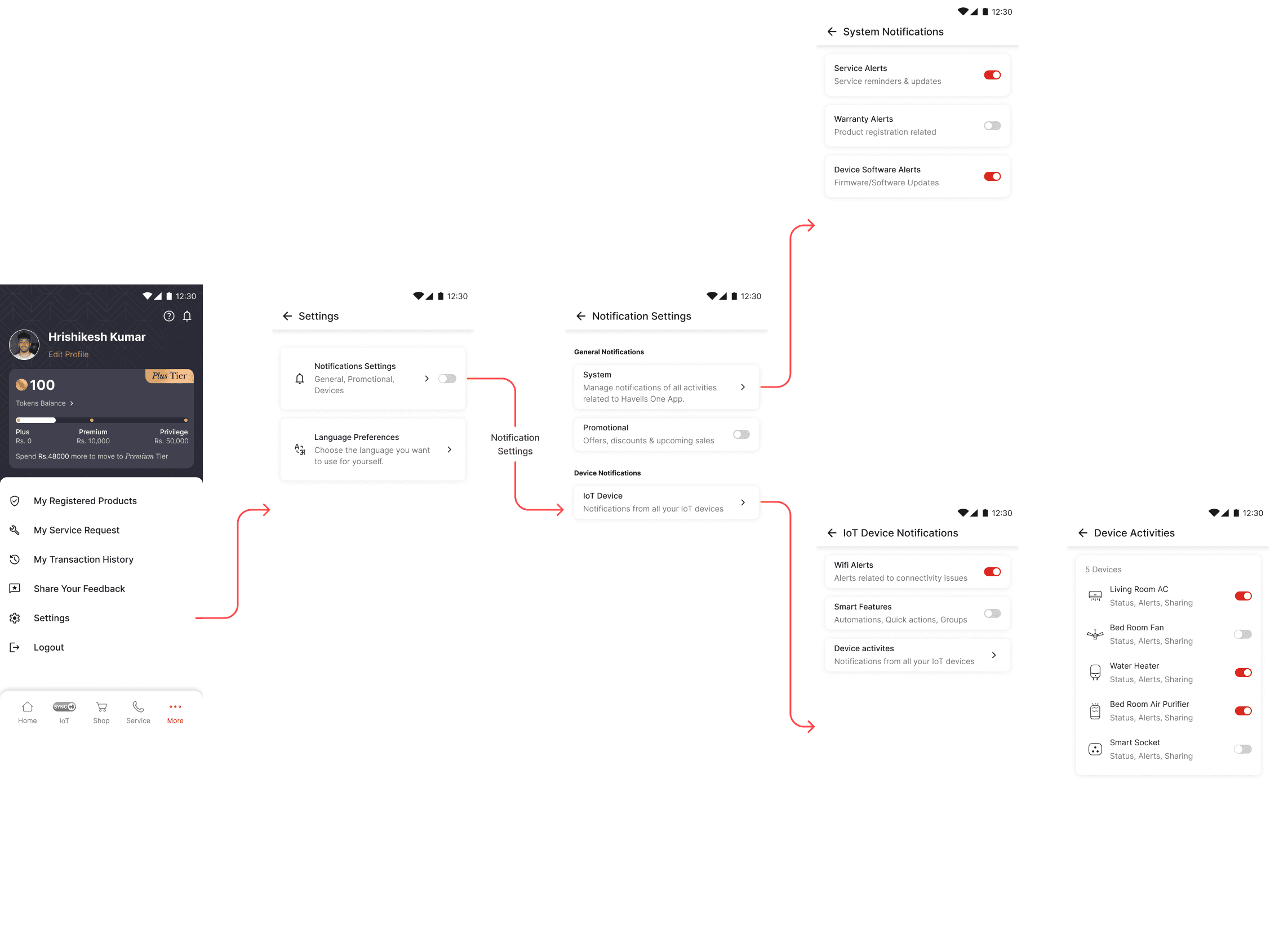
The final outcome was a structured notification management system that reduces cognitive load, improves relevance, and gives users greater control, while also enabling efficient backend filtering at scale.
The final outcome was a structured notification management system that reduces cognitive load, improves relevance, and gives users greater control, while also enabling efficient backend filtering at scale.
What changed?
What changed?
Key Learnings
Key Learnings
Designing for Scale Requires Systems, Not Screens
Across homepage tiles and notification management, I learned that individual UI decisions don’t scale unless backed by a clear system. Whether it was defining icon styles or notification categories, creating flexible frameworks early helped support future growth without redesigning from scratch.
Clarity Comes from User Mental Models, Not Assumptions
The card sorting exercise for notifications highlighted how users naturally group information. Designing based on these mental models, rather than internal logic, led to more intuitive categorisation and easier control.
First Impressions Shape Long-Term Engagement
Homepage tiles and splash screen both act as entry points. I learned that early interactions—visual clarity, speed, and feedback—play a critical role in how users perceive and continue using the product.